10 Psychological Tactics Marketers Use To Manipulate Consumer Behavior
There are two kinds of people in the world: people who don’t believe in the power of advertising and people who do. Usually, the second type sells things to the first one. Of course not all advertising and commercials are equally helpful, but marketers who understand the psychology of advertising can make you want a product you’ve never heard about before.
A good example of how a well-crafted publicity campaign can beat critical thinking is a Juicero startup. Juicero invented same name fancy juicer designed to squeeze juice from their own pouches with fruit mix. The Juicero itself cost significant $400 and each fruit mix pouch with no more than 10 oz (283 g) of juice cost additional $5-7. Juicero quickly became Silicon Valley favorite juicer as startup offered a monthly subscription on their fruit pouches and Silicon Valley loves subscriptions. Thanks to Silicon Valley Juicero raised over $120 million funds for its invention but shut down shortly after Bloomberg investigation. Bloomberg journalist showed you didn’t need Juicero to squeeze juice from pouches you could do it with your bare hands. The lesson of Juicero is that you can sell whatever you want if you know your audience. Keep reading to learn about tactics marketers use to trick and manipulate you.
Tactic 1. Making friends out of brands
Marketers aspire to make us feel strong affection to the advertised brand. For this reason, marketers need to explore us, define what we love, what problems do we have, survey the environment of our existence and the way it changes. Skilled strategists unearth what is important for a consumer even if it has nothing to do with their product, therefore well-developed brands become closer to the person, they fit organically to his/her life, become part of it. Such brands do not just talk about themselves they take an active stand on issues relating to the consumers, directly or indirectly affecting human behavior. That’s why you chew gum in the amount of two pieces and associate Christmas with red sparkling Coca-Cola truck.
Tactic 2. Propaganda of impulsive purchases
The good example of impulsive purchase is a giant bag of chips, pack of soda, or a candy bar you throw in the cart in the supermarket at the last second. At this moment you feel impenetrable satisfaction which in psychology called loss aversion. This phenomenon means that people are vulnerable to losses and try to avoid them at every cost. Literally. You will be a lot happier if you save $100 then if you unexpectedly find the same amount of money. Marketers use this weakness of the human mind, using short-term actions and loading advertising with catch-phrases like “only today,” “buy one get one free,” “till the end of the month.” With the development of instant payments, we make impulsive purchases more often as it takes us less time to pay for the goods than to actually consider whether we need those goods or not.

Tactic 3. Control over our senses
We used to think that in general advertising affects us with visual images and sounds: shiny cars, beautiful girls, crunching chips or the sound of the beer pouring into a glass – all of the above work on our feelings and play with our minds. But it turns out the most effective marketing tools are smells and touches. There is a term “embodied cognition” meaning the existence of complex relationships between senses, behavior, emotions, and decisions. Consequently, our brain works closely with physical aspects, and our sensations work closely with conscious and unconscious thinking. Simply put, our senses can control our behavior and influence our decisions. This statement was demonstrated by the experience during which respondents received pencils of different brands to compare. Some of the pencils smelled like tea tree oil. Two weeks later, respondents remembered better brands of scented pencils.
Another example of the use of the sense of smell is Disneyland. In order to make their attractions realistic Disneyland uses different scents: a scent of slightly musty water for the Pirates of the Caribbean or the scent of burning timber for the Burning Rome, Spaceship Earth. But some scents are intended to trick your mind and make you buy things. Like the intoxicating enticing vanilla aroma outside the Gibson Girl Ice Cream Parlor. Not only it’s proven vanilla creates a calming effect it also makes you hungry. And the next thing you know, you’re buying expensive snacks although you actually don’t want to eat.
Tactic 4. Clever Packages
Marketers have to understand consumer behavior psychology with an eye to create winning appearance for the product. Frequently packaging is the first and only way to introduce a product to consumers without using advertisement and long-running marketing campaigns. We chose an Absolut Vodka bottle to show you an outstanding example of the right packaging.
The year 1979, Absolut production company V&S Vin & Sprit AB decides to break into the promising USA market which yet characterized by the intensive competition. As of that day notwithstanding total amount of vodka consumption in the USA declined, the consumption of high-quality vodka increased. Thus Absolut decided to establish itself as pure, safe premium vodka with rich background and traditions. And the perfect packaging for such a product should have resembled something just as clean and safe as, for example, a pharmacy vial. Yes, it was an antique medicine bottle that inspired Gunnar Broman to design a bottle for Absolut vodka, which was later recognized as a masterpiece of modern design. The right packaging did the trick and led Absolut to the top brand in just 6 years.
Tactic 5. Impact on children
There once was a study proving children can’t recognise ads by the age of 4-5 years, which means children are a perfect advertising audience. Children a little older understand that advertising is trying to sell something to them, but up to 8 years they consider all the information in the commercials to be reliable. Annually companies around the globe spend circa 17 billion dollars on commercials targeted on children. In addition, children can give preference to a particular product by viewing just one promotional video. So that, between two identical food products children aged from 3 to 5 choose the one wrapped in the McDonald’s package.
Analyzing, in particular, the case of McDonald’s we may note they attract children with their vivid commercials and packages. The effect is achieved by using a combination of red color associated with celebration and yellow color associated with sun and joy.
Tactic 6. Clever placement of the object in the frame
The role of psychology in marketing is invaluable as it is the psychology that dictates conditions to advertising design. Look at these two photos: do you feel that cup in the photo on the right looks enigmatically more attractive? If you had to choose one of these cups, you would definitely purchase a cup on the right, and all because its handle turned toward you.
Skilled marketers while depicting objects of promotion always consider psychological influences of final images. As a result, they must achieve one underlying goal: to encourage mental interaction. Coming back to the example of two cups, consumers will prefer the cup with the handle facing right because this is how the majority of people grab the cup (most people in the world are right-handed). If the advertised object doesn’t have a handle a similar effect can be achieved by placing a supporting tool or a utensil on the right side of the object. You can be assured in our words by doing a quick search for images of the cereal bowl. See? In 90% of images, there is a spoon placed on the right side of the bowl. However, the examples do not end there. Marketers can position the opening of advertising objects toward us or remove a product from the packaging: everything to encourage our mental interaction with the product.
Tactic 7. Position images and graphics on the left
While designing a promotional, marketers consider the spatial positioning of images and texts. Those elements must coincide with the anatomy of our pathway: a stimulus located on the left is processed by our right hemisphere and a stimulus located on the right is processed by our left hemisphere. Taking into account our right hemisphere is better suited to process pictorial information and the left one is more into texts, placing the images on the left of the commercial enhances the absorption of the whole message. Our gaze automatically fell upon the catching pic we can’t control this. And that’s how marketers make their advertising work on us.
Tactic 8. Moving the position of the brand or logo
This tactic applies to well-known established brands. Sometimes all you need to return attention to the product is to play around with logo position or logo itself. Even though changes might be hard to recognize, subconsciously we will notice them and develop stronger preference toward that content because of higher fluency. That’s why from time to time we read seemingly ridiculous news about famous brands spending millions of dollars to add an invisible squiggle to their logo. All those money and efforts pay off with the increase of our attention and consequently revenues.
The key example of how unnoticeable changes can draw the world’s attention is Google logo. At the end of the May 2014 Reddit users noticed that Google made cosmetic changes to its logo. The designers of the company moved the second “G” one pixel to the right, and “L” moved one pixel down and to the right. Thus, the lower bounds of the letters “L” and “E” are now on the same straight line. Honestly, the changes were so teeny-tiny that we personally doubt Reddit users noticed them without the help of Google marketing department, but still. They reached their aim the whole internet was buzzing about it for days.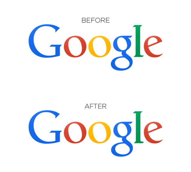
Tactic 9. Emphasize product flaws
Advertising seemingly should show only benefits of a product and compare it with other products of one category, as the best. But in an environment of frenzied competition, this approach no longer works. In fact, it has not been working for almost 60 years with the release of Volkswagen to the American market. But we’ll get to that.
So, why do marketers downplay the merits of their product? It’s all about the same social psychology. The consumer no longer believes in all the magical promises advertising whispers on his ear. They may even have the opposite effect. However, when marketers represent the product as imperfect, it enhances consumers’ level of trust. Of course, no one will stick out real shortcomings, you will not find any advertisement screaming that chocolate will rot your teeth. No, this will be a surprise for you.
Disadvantages are often far-fetched. They may even be the main features of the product, but marketers present them as flaws. It gives you feeling that some secret information has been shared with you and that the product is in fact much better. This tactic is similar to how some girls on social networks post fabulous selfies with discontent text under them to attract attention. Well, auto concern Volkswagen invented that thing back in 1960, in order to present their “beetle” to the American audience.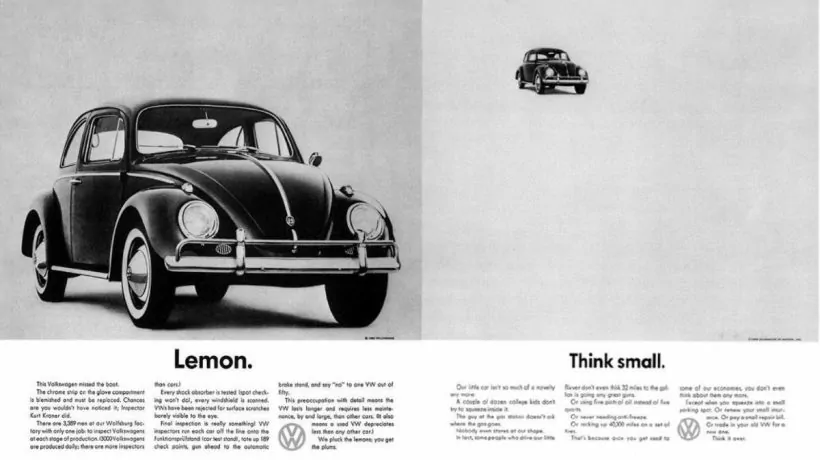
An ad for Volkswagen contained a one-word headline: “Lemon”, and the motivational text read: “Think small.” Back to those days that advertising was shocking as all cars adverts looked like this: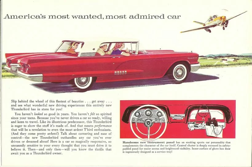
The words of the era were: the bigger the better, and to say think small was at least revolutionary. Volkswagen made a bet on the risky strategy, and it worked out well for them.
Tactic 10. Promote exclusivity
Probably, the most important and useful strategy among all listed above. We want to feel important; we want to be a part of an exclusive group. Marketers use our complexes to get under our skin.
The psychology of marketing is based on the principle of deficiency. The deficit principle asserts that we value inaccessible things the most hence a unique thing causes an irresistible curiosity and desire to find out, what we will miss if we lose it.
That’s why people line up on Black Fridays or get up at 5 am to pre-order the latest iPhone. Everyone wants to be among the few lucky ones who own an exclusive product.
These same emotions encourage users to fill out forms on landings with limited time or a number of offers – from the principle “before it’s not too late”.
